
Data Driven Design complements subjective judgments with objective facts. Using user research and A/B tests, we ensure that every layout is visually convincing and functionally performs perfectly. The result is corporate websites that understand their target audiences and measurably contribute to business success as a tool.
When taste decides, performance often loses. We all know this from long meetings: heated discussions about button colors, imagery, or navigation placement. In the end, it's often not the best argument that wins, but the opinion of the highest-paid person in the room. The problem? We're not designing for ourselves or for management – we're designing for the users.
This is where Data Driven Design comes into play. It serves as an effective safety net to reduce the risk of costly wrong decisions. It's not about replacing creativity with bare numbers or creating "digital uniformity." It's about testing creative hypotheses before implementing them.
Why Good Design Must Be Measurable
We don't see design as visual cosmetics, but as a measurable driver for your revenue. Measurability gives us the opportunity to objectively validate design decisions. The clearer the data situation, the more precisely we can align the UX/UI Design with the targeted ROI.
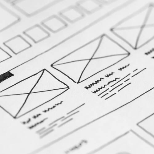
A common mistake in development is to write code first and then check whether the concept works. This approach unnecessarily drives up costs. The reverse approach is more efficient: design and user experience should be validated as early as possible. Different "fidelity" levels are suitable for this. The range extends from simple wireframes to interactive click dummies that already convey the feeling of a real app before development.
The more accurate the prototype (high-fidelity), the more precise the data we gain from it. We identify problems in user guidance long before expensive developer hours are incurred.
Risks of Untested Design Decisions
We often fall into the trap of projecting from ourselves onto others. This becomes particularly dangerous with the HiPPO phenomenon: The manager thinks blue is better than green, so the button becomes blue. However, this relies on gut feeling rather than evidence. When subjective taste dictates strategy, you develop past the market. Data Driven Design protects you from this operational blindness.
What is the HiPPO phenomenon?
The acronym stands for Highest Paid Person's Opinion. Beware of the HiPPO! Anyone who really wants to understand trends and interactions should tame the "hippo" in the room with real data.
Avoid "design wallpaper" without function! We often see websites bursting with effects but failing to answer basic user questions. Design must not be mere decoration. Therefore, "form follows function" applies.
To remain visually relevant, it's worth regularly looking beyond your own nose. What styles currently shape the market? What interactions do users expect today? We regularly examine such developments in our insights to provide our clients with fresh impulses. But instead of adopting trends wholesale, data-based analysis enables targeted fine-tuning for your customers.
What Is the Difference Between A/B Testing and User Testing?
Many throw these terms into one pot, but they answer completely different questions. To successfully use Data Driven Design, we must understand when to pull which tool from the toolbox. The rule of thumb is simple: A/B tests tell us what happens. User testing explains why it happens.
How A/B Tests Improve UX
In A/B testing, we send two or more versions of a page (e.g., a landing page) into the race. Group A sees the original, Group B the variant with the new button or alternative user flow. The data then shows us in black and white which version converts better. We're validating a finished hypothesis with hard numbers here.
Elements That Make the Difference
A classic is the call-to-action (CTA), but we go deeper. To increase performance, we specifically vary:
- Positioning: Does the button work better "above the fold" (visible without scrolling) or only after the product has been explained?
- Navigation & Search: Do users find their destination faster via a mega menu or via a prominent search bar?
- Performance and Interactivity: Every millisecond counts: if a page loads too slowly, users bounce before they even see your offer.
- Subtle Design Signals: Sometimes it's purely visual aspects that influence click rates. We show you how design elements like button shapes have a massive psychological effect on conversion in our article about rounded corners in web design.
- Social Proof and Trust: Elements like customer reviews, certificates, etc. can strengthen trust in a brand.
- Smart Forms: How you place and design forms determines whether users abandon or convert. Shorter forms lower barriers and often increase conversion rates.
Hard Currency: The Right Metrics
A test is only as good as the data it delivers. We don't measure success by feel, but based on clear KPIs:
- Conversion Rate: The most important value. How many visitors perform the desired main action (purchase, lead)?
- Time on Site: If users stay on the page longer, this indicates relevant content and good readability.
- Optimization Potential in the Funnel: Where exactly are you losing your potential customers? Whether in checkout, in the middle of a form, or during registration – every exit reveals a weak point in the process.
User Testing for Real Insights
While numbers show us that a problem exists, user testing opens the window to the motivations: it makes visible the barriers, expectations, and real emotions of users behind every interaction. Because we often optimize elements that aren't even relevant to the user.
Warning Signals We Identify
Before we write code or go live, we simulate usage. In doing so, we uncover stumbling blocks that were invisible in the design draft:
- Logic Breaks: The user expects result B after click A, but lands somewhere else.
- Content Blindness: Important USPs are overlooked because they visually look like advertising (banner blindness).
- Technical Friction: Processes that seem logical to us feel unnecessarily complicated to the user.
From Problem to Strategic Solution
User testing is not an end in itself, but a tool for quality improvement. We use the insights specifically for:
- Hypothesis Formation: We don't guess what to test in A/B testing, but test based on real observations.
- Prioritization: We first fix the pain points that really frustrate users, instead of just polishing cosmetic details.
- User-Centricity: We constantly align our assumptions with reality. You can learn about how we structure this empathetic process in our article about Design Thinking.
Decision Guide: When Do I Use What?
Now you know the theory behind both tools. But when do we reach for which method in everyday project work? There's no point shooting cannons at sparrows or looking for statistical significance where qualitative insights are missing. So you can immediately choose the right strategy in the next meeting, we've compactly compared the differences for you here:
| Criterion | A/B Testing | User Testing |
|---|---|---|
| Core Question | Which version works better? (What?) | Why don't users understand something? (Why?) |
| Data Type | Quantitative (numbers, click rates, conversions) | Qualitative (observations, statements, feelings) |
| Participants | Many (often thousands needed for relevance) | Few (5–10 people often sufficient for patterns) |
| Ideal Timing | For optimizing existing elements | For finding problems & generating ideas |
| Goal | Increase conversion rate | Improve UX/UI Design & usability |
Challenges and Limitations of Data-Driven Methods
A/B and user testing are not the be-all and end-all. Both methods of Data Driven Design also bring challenges with them.
1. Data Quality as Foundation
Precise insights require a clean data foundation. When tools work inaccurately or data only comes in fragmentarily, analysis suffers. Therefore, we continuously verify collected data: only those who verify their numbers create a reliable basis for smart decisions.
2. Poor User Testing
For user tests to offer real added value, the framework conditions must be right. Representative participants and clear questions prevent random results from influencing strategy.
3. Danger of Random Results
Anyone who conducts A/B tests with samples that are too small or tests countless variants without a clear hypothesis risks random findings. Such results often cannot be reproduced in practice. Professional standards require clean test design: we determine in advance how large the sample must be to achieve statistical significance.
4. Relevance of Findings
Success concepts from a specific area often cannot be copied one-to-one to new situations. What works today for one target group can already fail tomorrow in a different context. Best practice is therefore to regularly question and revalidate gained insights.
Conclusion & Outlook
For us, Data Driven Design is not a replacement for creativity, but its strongest ally. Data helps us critically question subjective impressions and makes weaknesses in design visible that would otherwise remain hidden from us. But they cannot feel. To create a digital experience that satisfies users and fulfills set business goals, we need both methods. Both the cool precision of analysis (A/B tests) and the warm understanding of human needs (user testing).
Those who blindly follow the algorithm end up with uniformity. But those who use data to remove barriers create space for real brand identity. Want to know how your website not only looks good but also performs? Our UX/UI design team supports you in setting up the right tests and turning visitors into real customers.